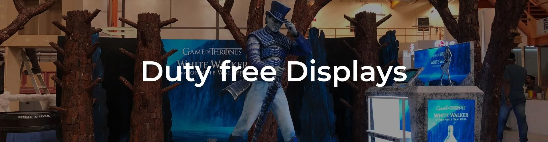
In the competitive world of duty-free retail, it is important to stand out and attract customers. One effective way to do this is by using colors in visual merchandising and Point-of-Sale (POS) displays. But why are colors so powerful in influencing consumer behavior? This is where color psychology comes into play.
When designing POS displays for duty-free retail, understanding how color affects consumers can be highly beneficial. Certain colors used in duty free POS displays can evoke specific emotions and create a sense of urgency, prompting customers to make a purchase.
Red creates action:
Red is often associated with passion, excitement, and danger. In retail, it can create a sense of urgency and encourage impulse buying. This makes it an ideal color for limited-time offers or promotions in duty-free shops.
Blue builds trust:
Blue says safe, tested, and reliable. Skincare and health products sit well against blue backgrounds. It relaxes the shopper. A calm customer picks up an item without second thoughts. Dark blue adds a premium touch. Light blue feels fresh.
Yellow grabs attention from far:
Yellow works for discount bins or travel-sized goods. It jumps off the shelf. The human eye sees yellow first. Use it on a corner display or a small shelf strip. Yellow promises happiness and low cost. It works best with black text.
Green connects to natural and fresh:
Green suits organic snacks, teas, or natural cosmetics. It cools down the impulse zone. A green backdrop makes a product feel harmless and good for you. Pair green with wooden textures for a grounded look.
Orange triggers playful impulse:
Orange works for fun itemscandies, souvenirs, small gadgets. It feels friendly, not serious. Orange pulls a smile. A pop of orange on a bottom shelf lifts the whole display. It encourages last-second grabs.
Black and white for high contrast:
Black backgrounds make colors pop. White keeps things clean. Use black for premium alcohol or perfume. White for bright, airy products. High contrast helps tired travelers read labels fast. It also looks expensive without shouting.
Final tip: match color to product type. A red sports drink sells better than a blue one. A green lotion feels safer than a red one. Test two versions. Watch what sells. Color psychology is the cheapest, fastest upgrade for any duty free POS displays.